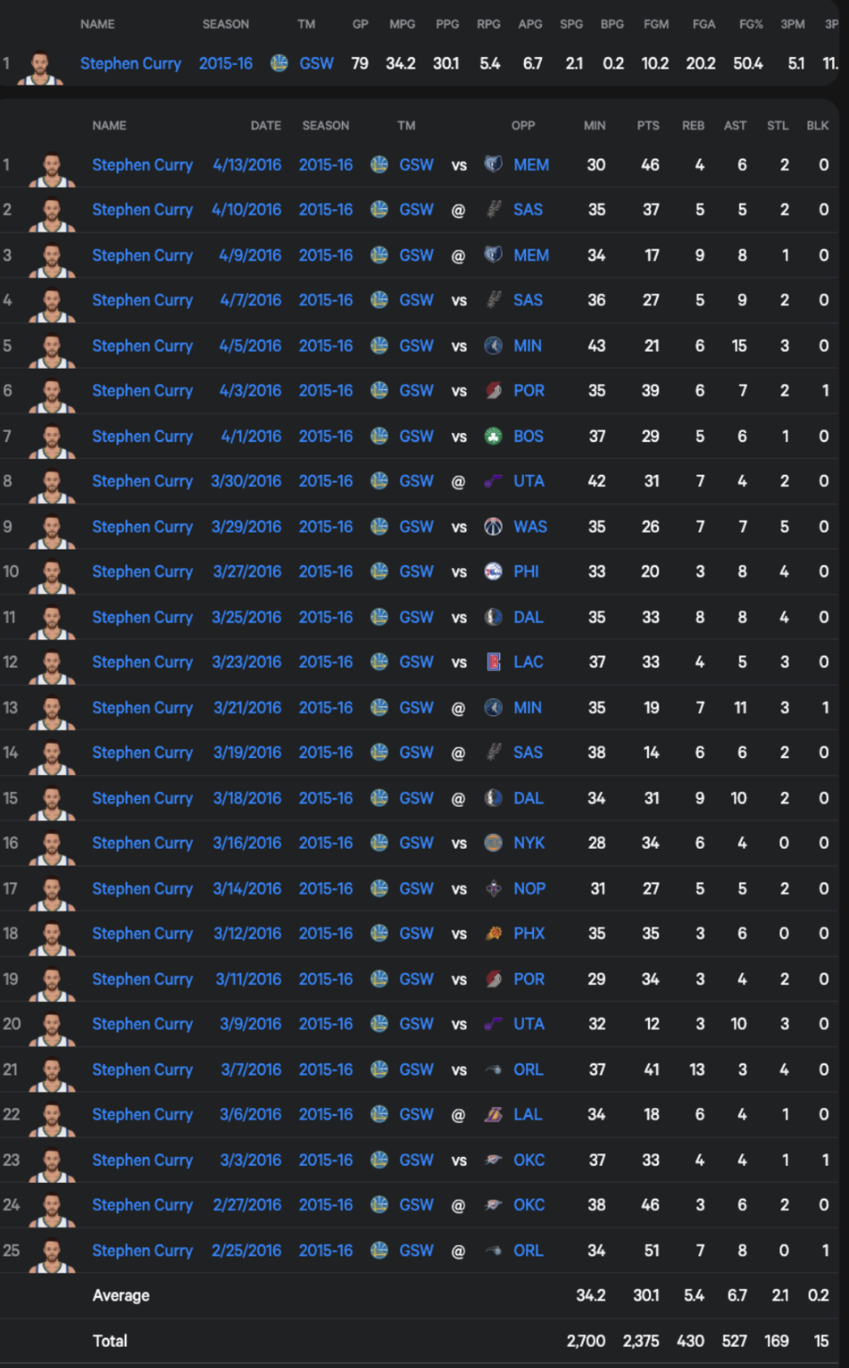
The raw data that I found was based on Steph Curry’s stats per game in the 2015-2016 season. The specific data that was of interest to me was Field Goals Made, Field Goals Attempted, and Field Goal Percentage. This will tell me his shots made/missed.
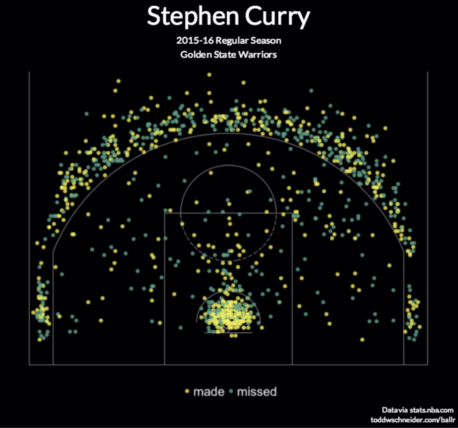
The first diagram marks out every shot made, where Steph took it from, and whether he made it. Its very easy to digest just by estimating whether there are more yellow dots or green dots. This diagram is definitely more to give the viewer a general feel rather than specific data (e.g, users are not expected to count every dot)
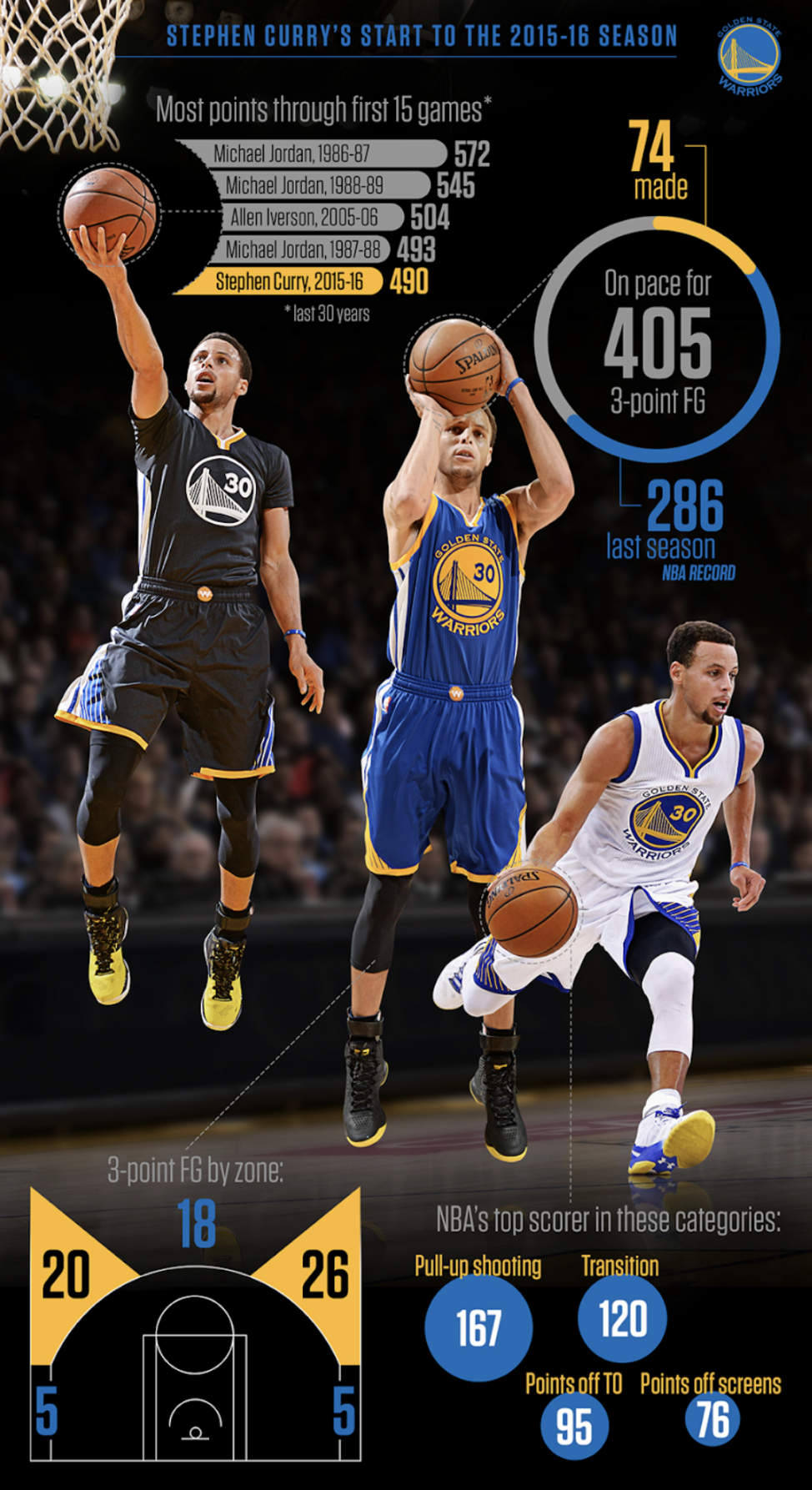
The second diagram sections the shots made into zones - this leaves out the specificity of where each shot was made that the previous diagram had. However, this graph has more categories for comparison, such as against other players, against last season’s stats, and what categories Steph is leading in in the NBA.
The last diagram looks at Steph’s entire career. Therefore, the raw data is only applied to the 2015-16 part of his career. The graph makes it really easy to understand how well Steph performed in 2015-16 compared to other years - this is something we could not have gained from just the raw data.
I think that a lot can be learned from the first diagram. Steph seems to have a spot in both the very left and right of the 3-point line that he avoids. He could train taking more shots from there. Steph should also focus the most on 3-point shots and lay-ups as this seems to have the highest success rate.
In Diagram two we can see that Steph is very comfortable with taking 3-point shots. He has a high chance of scoring, especially as the defense most likely has not set yet. Steph should keep on taking early shots. Opponents should engage in defense earlier to stop these shots.
We can also learn that 2015-2016 was the best year in career. This could be replicated.
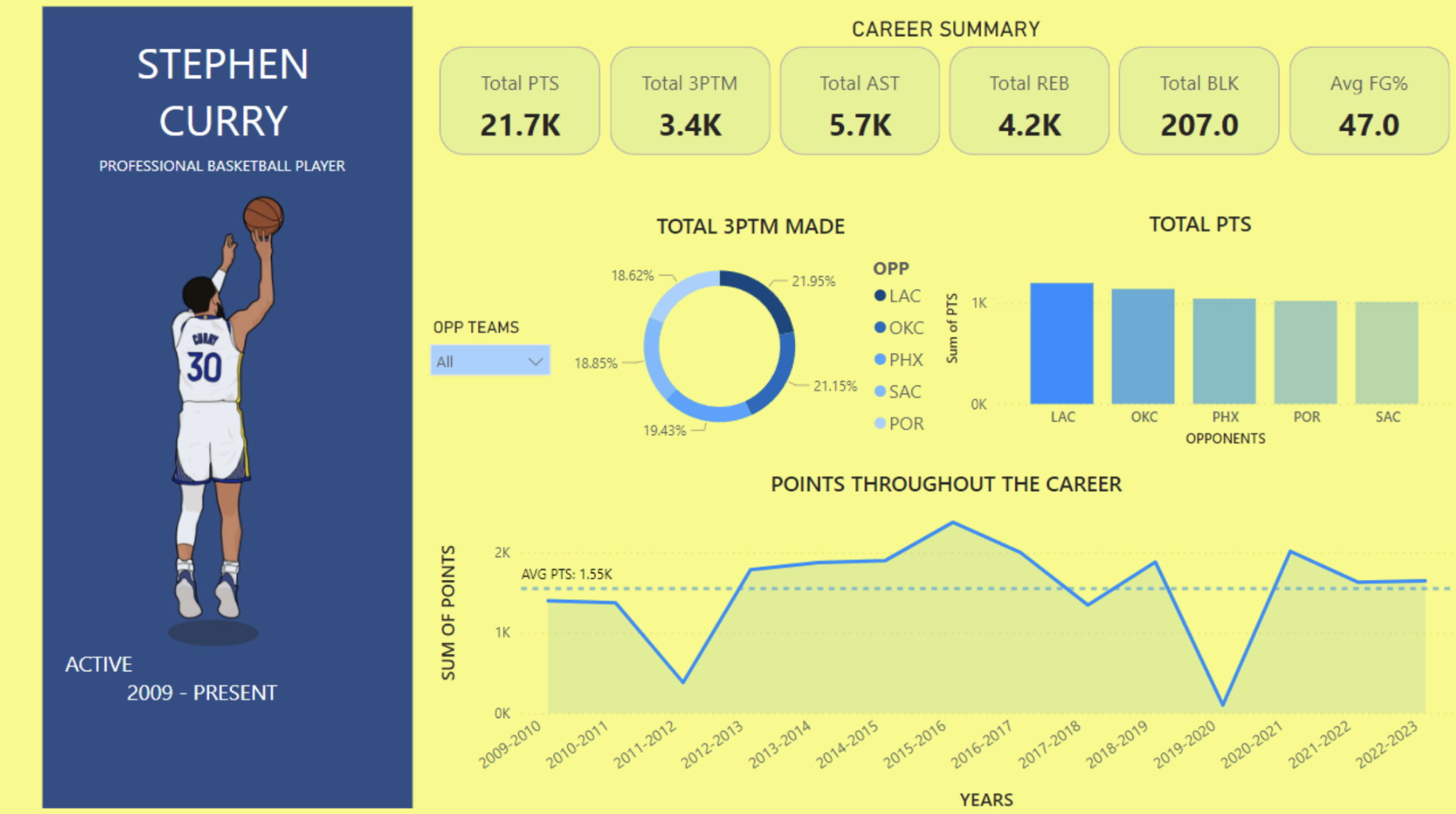
Diagram one could have some more general stats that summarise what we are seeing in numbers, so far viewers can only get a general idea of how many shots were made.
In Diagram one it would also be interesting if you could drag a virtual ‘Steph Curry’ somewhere onto the field and have it calculate the odds of him scoring/missing.
In the third diagram the designer can add a feature so that you can see the exact stats of the season when you hover over a region in the timeline. Furthermore, it would be interesting to be able to manipulate his stats per year to make “what-if” scenarios. The changes can be reflected in the overall timeline.